Rebranding myself — Part I
As someone who grew up with the dawning of social media, I am no stranger to branding oneself. Individuals brand themselves every day with their choice of attire, music, language, and more. Some people are aware that is what they are doing when they tag themselves with buzzwords such as “romancecore” or “pastel goth,” but others make their personal branding choices subconsciously when they decide which water bottle to buy or which clothes to wear each day. For better or for worse, I as a designer, have become acutely aware of personal branding from two fronts: personal style and personal design.
Personal style is something that lives with me everywhere I go, but a personal design is something I have to curate to show others how I work and what sorts of things I can create. I need to create a branded image for myself as a designer that incorporates my tastes while working with the constraints of the digital realm because computers are king. This means that what I design needs to scale without losing quality or legibility and needs to be simple enough not to bog a machine.
I am afraid that it will end up the same way well-known companies end up after an image refresh: a reversion to the old and the recognizable or a regression to the mean. To avoid this fate, I drew from my tastes.
I need to create a branded image for myself as a designer that incorporates my tastes while working with the constraints of the digital realm.
My artistic tastes were formed in my youth by what I have coined “dirtbag artists” of desert communities. After schooling, I gravitated towards the Arts and Crafts movement of the late eighteen-hundreds, the anti-design movement that started in the '60s, and the roughness of the punk movement and the grunge movement. However, I was trained as a graphic designer to create a finished product— that constraint does not mesh well with the rough and raw images that I crave. This leaves me in a conundrum: do I work with my tastes and risk looking untrained or do I distill my tastes to fit what looks “finished”? To solve my design problem while navigating my conundrum, I just needed to start designing.
Step 1
Here is an iteration of my first logo-ified name:
I drew my inspiration from the elegance of my name, the more romantic curves that are found as part of the Arts and Crafts movement, and my unabashed love of brown and beige (because those colors remind me of dirt and I like dirt). This iteration felt good for a time until I realized that while my name is elegant, I am not. I am… rougher than that.
Step 2
Going back to my artistic roots, I got my hands dirty. Here is a collection of stamps I carved intuitively. For this round, I focused on nothing but feeling and my desire to create, create, create. I was pleased with the texture of it all but concerned about legibility and its capacity to vectorize for scalability on digital screens.
Step 3
I went back to the computer. This time I kept it simple and just typed my name. Over and over again. In lots of different typefaces that I enjoy. I asked people who knew me well to highlight which typefaces they thought were most like me. These were what was highlighted.
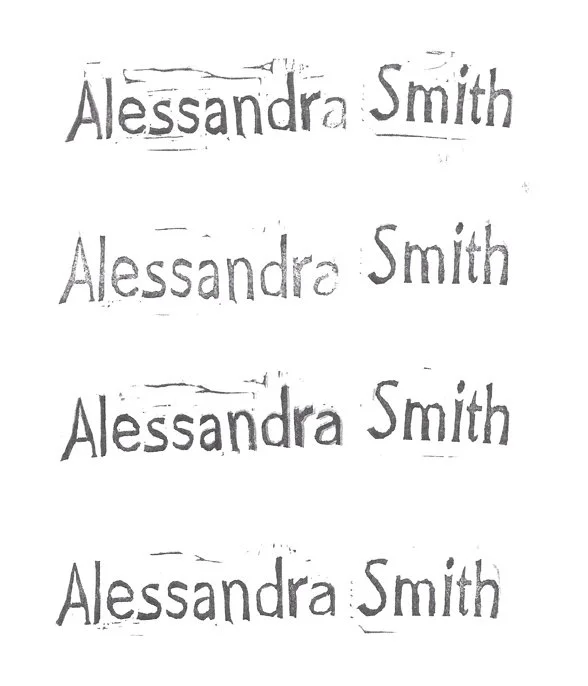
Since I chose all the typefaces originally, I went with the option that had the most consensus. It was then time to give it my personal touch. I carved it into a stamp.
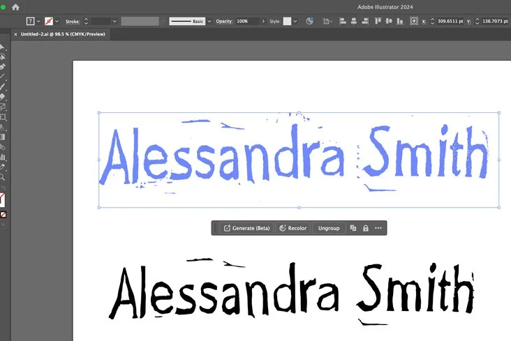
I am at an impasse again, though. I am facing the same issue I did with previous stamps: their capacity for vectorization. I gave the scan of this stamp a few tries. However, the problem remains that the texture of this stamp is too complex for it to be a good vector graphic. There is just too much information for the translation to be practical.
It is back to the drawing board for me, but in the meantime, I am distilling my branding to purely my name.


